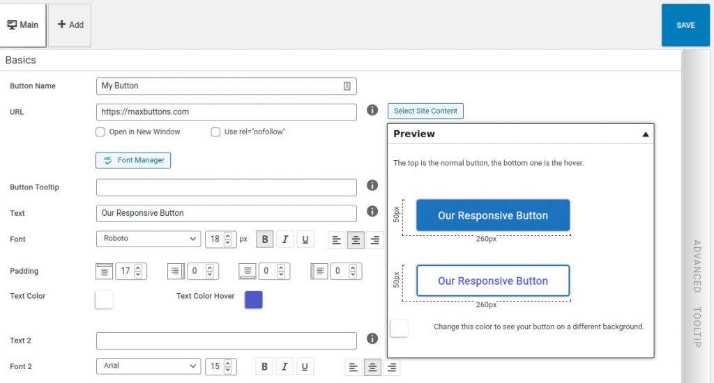
MaxButtons Pro 8 boasts a new system for creating perfect responsive buttons. With our Live Preview system, you can easily create and preview buttons for any device, seeing the result real-time in the preview while creating them.
This makes MaxButtons Pro 8 the button plugin with the most responsive options offered by WordPress and also one of the most user friendly.
This article details how to create responsive buttons of your choice on a whim as well as all the other improvements MaxButtons Pro 8 now offers!
Upgrading from Previous Versions
This is a major update. When upgrading from previous versions we strongly recommend you backup your database first.
If you currently have responsive buttons, don’t worry – they should be fine. After updating just take some time to make sure everything is working correctly. It’s possible there may be some minor changes and you will definitely want to look at our new features.
Creating responsive buttons
Creating responsive buttons is pretty straight-forward.
First, create your button in the “main” tab window view to see what it looks like without any specific device in mind. It’s best to design and create the button first before thinking about responsive styles. Most of the time responsive styles are just simple alterations to make sure they look good on different screens. Keep it simple!
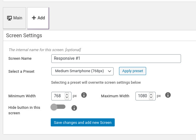
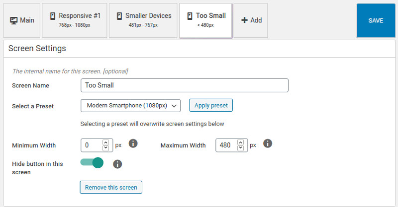
Second, add a responsive screen, by simply clicking ‘add’. You can then re-name the screen to something more convenient and easier to remember. There are a few presets you can apply. Like filling out the minimum and maximum width of the device screen you are targeting. You can choose any value you like. If you set the field to zero it means no maximum (or minimum).
If you change your mind later, all these values can be edited later, so don’t be too afraid to experiment. Don’t forget to Save Changes, after which, you’ll see your new screen next to “Main” and you can go ahead and create another one by repeating these steps.
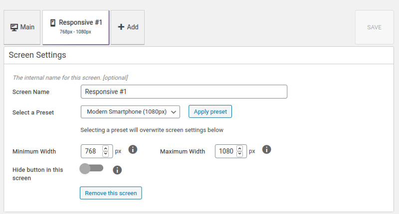
It’s that easy! You’ve added a responsive option to this button. If you click on the responsive tab you’ve just created, you’ll see the options are the same as the Main tab and that the button looks the same in the Live Preview. You can also see your name and the device sizes the layout applies to.
When you make changes to these settings though, it will only apply to the button for that size screen. Most of the time, the button size and font size will be changed to make it fit.
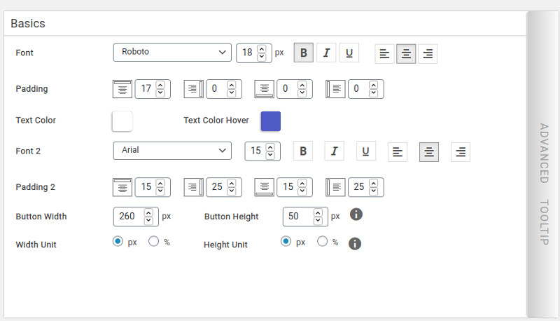
New in version 8: The ability to set the width and height of the button not only in pixels, but also percentages. This makes it really easy to create a full-size button!
From here you can define as many screens as you want, however, to keep it simple try not to go overboard. In the screenshot we’ve shown a typical number of responsive options that cover most devices in most situations.
Try not to overlap the sizes for the screens you create. While it will probably still work perfectly, it will help to avoid confusion and possible strange results.
On the ‘Too Small’ tab screenshot, you can see that we’ve set the “Hide Button” option to on, so that any device under 480px will not show this button. It’s a great way to hide buttons that are not needed on really small screens.
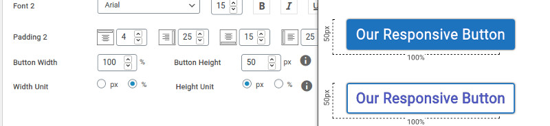
In the ‘Smaller Devices’ tab (screenshot above) we’ve changed the Button Width to 100% and increased the font size so that on those devices the button will be in an easily readable size, spanning the entire screen.
And that’s it! When you’re done creating your screens and editing the buttons, you can now quickly see what they’ll look like in the Live Preview just by clicking through the tabs.
Don’t be afraid to experiment. If you don’t like a responsive option at any time, you can remove it with the click of the button.
Enjoy!
Other Improvements:
The responsive button option is by far the biggest and most innovative addition to this update, but that’s not all! We have also worked really hard to make the Live Preview better and faster!
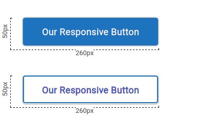
Live Preview screen now shows dimensions so you can quickly see the size of the button.
Our Google Fonts Library has been updated and now contains 987 fonts.
Several smaller bugs have been fixed to increase speed of the button editor.
CSS shorthand support for styling, making the button output smaller.
Improved handling for background images and icons so you can make buttons beautifully in any shape.
Get MaxButtons Pro 8!
If you are an existing customer with a valid license the new version will roll out via the WordPress updater shortly.
If you’re not, buy Maxbuttons PRO now and prepare for the next level of WordPress buttons!