Building responsive buttons in WordPress can be a challenge. Luckily MaxButtons PRO makes it easy to adapt your button designs for mobile devices.
Recommended workflow:
Design a button in the button editor
Once done and happy with the design, check how the button works on your website
If on mobile devices the design is off, make changes to the responsive button ( discussed below )
Automatic Responsive Options
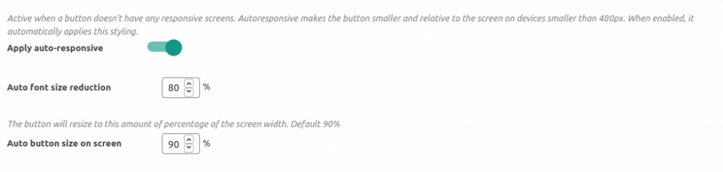
By default, when no responsive screens are created the plugin will apply two changes to the button when views on mobile devices smaller than 480 pixels. This usually covers many cases. Font size reduction: Will reduce the font size this X percentage of original. So if the button font is 20 pixels, on the responsive screen it will be 16 pixels. Auto Button size on screen: Will make the button relative to the screen or container size. Default is 90%, which is almost the full screen size. Note: While this is a good starting point for many buttons, this is maybe not the case for all. If you create a responsive screen for a button in the button editor, these options will no longer be applied.
Creating Responsive Buttons
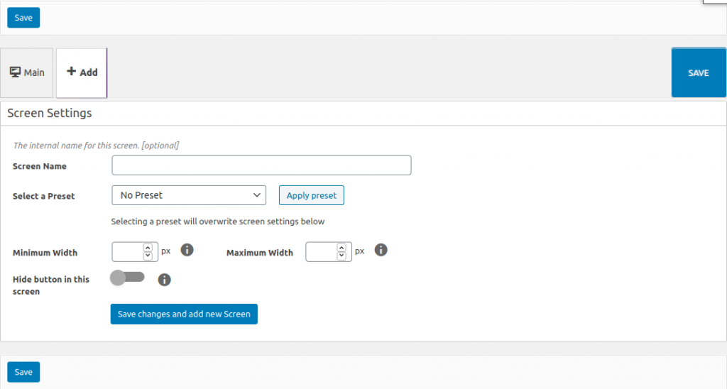
After you created the main design for your button, you can change the styling of this button by adding a responsive screen. This can be done in the button editor by clicking on the Add Tab on top. This will show you several options.
The most important are minimum width and maximum width. These fields define when the responsive styling will be presented on your webpage. Outside that resolution, the styling of your main button will be applied.
Tip: Check the most common screen sizes to see what mobile devices are in use and what to target. Your analytics software usually has a section to check this for your site as well.
Tip: Many browsers have a ‘responsive view’ in their developer modes so you can check your own webpage on several resolutions. In Firefox you activate it by hitting CTRL+SHIFT+M on the keyboard. In Chrome first hit F12 for developer console, then CTRL+SHIFT+M
If you put a minimum width of 0 (zero), this will target any device up to the maximum width. Similarly putting a maximum width of 0, will target any device from the minimum settings.
Hide button in this screen will completely hide the button within those resolutions. This will allow you to create mobile-only ( or desktop-only ) buttons.
Hit Save Changes and Add New Screen when done. Don’t worry, you can change all the values after saving. When done, you will see the new screen which is similar to the button editor. Here you can change the appearance of the button according to your needs.
Tip: Try to change not too much and keep the amount of screens low. This will make changing and maintenance of the button easier.