With MaxButtons you can define the width and the height of your button in various ways. This depends on where you intend to use the button.
Pixels (px) – Your button will be this exact size in pixels Percentages (%) – Your button size for width will depend Auto – The button size is calculated automatically.
Fixed width
In most cases a fixed width will suffice . You can simply enter the dimensions in pixels and the button will show everywhere in that size.
I’m using columns in my theme
If you are using a column or special layouts in your theme, it’s often best to use percentages. You can then specify how much space the button takes up in this column. When using pixels, the layout often breaks when viewing on smaller screens
Let the Button decide
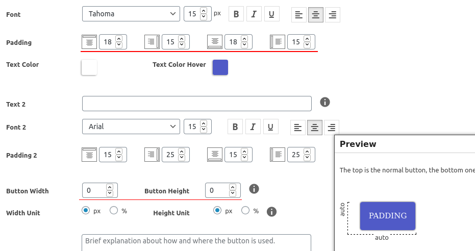
When you put the value of the width or height to 0 (zero), the plugin will put the dimension to ‘auto’ . The result is that the content of the button will be leading. You can make it pretty by applying padding. The width will roughly be:
padding left + width of the text + padding right
This is very handy when you want to make a lot of buttons in the same style, but with different text. The text will always fit!
Mobile Devices
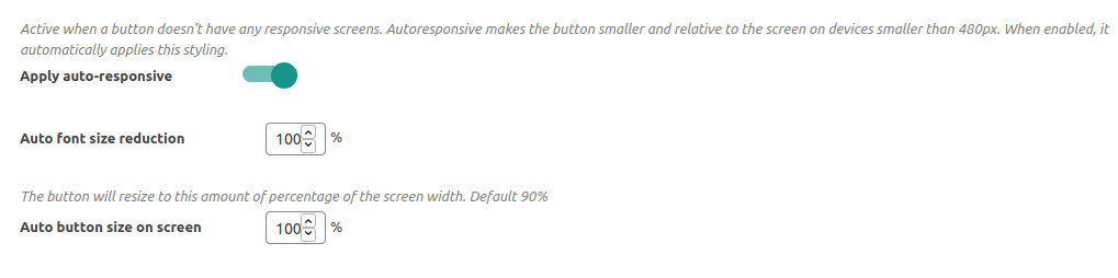
For responsive websites when viewing on a mobile device the button can be too big or not big enough for the screen. In MaxButtons you can easily fix this. Create a new responsive screen. In the mobile screen you can change dimensions. When designing for very small screens, consider putting the buttons to 90% or 100% screen width for maximum flexibility.
By default, the plugin already changes the button on mobile devices automatically. Read more on Responsive Settings.