Struggling with how to create WordPress buttons for your site? WordPress makes it easy to insert regular text hyperlinks right from the WordPress Editor, but it doesn’t give you a way to easily add buttons.
For that reason, many WordPress users struggle with how to add buttons to their WordPress posts or pages. That’s why we wrote this big guide to using buttons with WordPress.
We’re going to dig deep into the topic of WordPress buttons to show you a couple of different ways to add buttons to your WordPress content.
We’ll start with a basic introduction on how to create CSS buttons on WordPress. It’s not the most beginner-friendly way to add buttons, but it is the foundation of all buttons.
Let’s jump into the CSS first!
How To Use CSS To Create WordPress Buttons Without A Plugin
Without a WordPress plugin, you’ll have to resort to the method that web designers use to create buttons for any type of website – CSS.
CSS, short for Cascading Style Sheets, helps you control the appearance of the content on your website. While you can use CSS for a whole heap of things, part of what CSS does is to let you style links on your site to look like buttons instead of regular text hyperlinks.
You mark these links with a little code snippet (a CSS class or ID). Then you can add CSS code to the WordPress Customizer (or other places, if desired) to actually control how your button(s) look.
At a basic level, building a simple button with CSS involves just a few different concepts. We’ll give you a real example of how these work in a second – but for now, let’s just go over them at a theoretical level:
- background-color – this lets you control what color your button is.
- border – this lets you add an optional border to your button
- color – this lets you control the color of the text on your button
- padding – this lets you control the spacing of the text on your button. This one can be a little hard for beginners to grasp – but you can just play around with the numbers until you find an alignment that you like.
- font-size – this lets you control how large the font will be on your button.
The above options are by no means a complete list of all the ways that you can style your buttons with CSS. But by using just these properties, you can build a basic button without needing a plugin.
A Real Example Of Building A Basic Button With CSS In WordPress
Alright, here’s your quick-and-dirty primer to CSS.
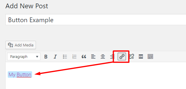
Let’s say that you want to use the above principles to build a basic blue button for your site.
The first thing you need to do is add a normal link in the WordPress Editor:
Then, you need to pop over to the Text tab in the WordPress Editor and add a CSS class to your soon-to-be button. Let’s call it “mybutton” for this example. You do it like this:
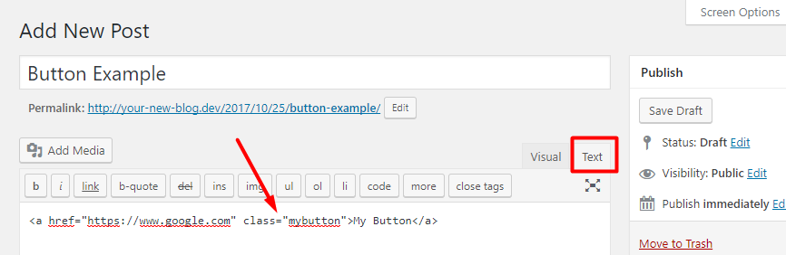
Your visitors won’t see this code – but adding a CSS class like this allows you to go ahead and style this link like a button.
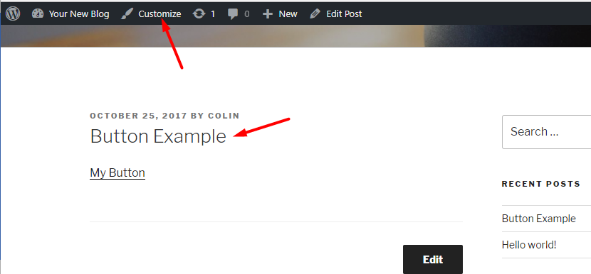
Go ahead and publish that post like normal.
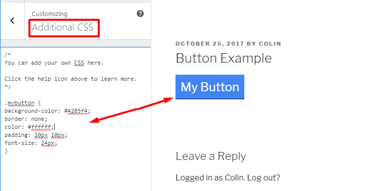
Now, go to the WordPress Customizer to add some CSS. Go to the post you just published and click the Customize button on the Admin Toolbar:
Now, click on the Additional CSS tab and paste in this basic CSS code:
.mybutton {
 background-color: #4285f4;
 border: none;
 color: #ffffff;
 padding: 10px 10px;
 font-size: 24px;
 }
As you add the code, you should see your link’s style change in real-time like this:
If you want to change the colors, adjust the hex-codes used in the code sample. Similarly, you can play around with the padding to adjust how your button looks.
As far as creating a basic button, that’s all you need to do. But there’s a big caveat. If you want to make your buttons more usable and stylish, you’ll need to consider some more advanced CSS.
More Advanced Considerations For CSS Buttons
Having a button that looks good is great – but you also want it to be easy for your visitors to use.
To do that, you’ll need to consider things like:
- Responsive design – you need to make sure your button is just as stylish and usable on mobile devices as it is on the desktop version of your site.
- Containers – one neat trick to help position your buttons and make it easier for people to click on them is to insert your button inside its own container. By doing this, you can control the spacing and alignment of your button on a page.
- Hover effects – you can make your button’s style change when a user hovers over it.
As you can see, while creating a basic button with CSS isn’t too difficult, getting all these nitty-gritty details right can get a little more complicated.
For that reason, if you’re not already decently familiar with CSS, you might prefer to use a WordPress button plugin that handles these things for you…
Using a Plugin To Create WordPress Buttons
If you’re a total beginner (or just a WordPress developer looking to save some time), using CSS to create buttons on your WordPress site is likely going to:
- Limit the types of buttons that you can create
- Waste your time
For that reason, you might be better off using a plugin to create WordPress buttons.
MaxButtons is a freemium plugin that helps you implement many of the button strategies discussed above without needing to get your hands dirty with actual CSS code. You can create a button design using the plugin’s interface. Then, you can reuse that same button style for different links by simply switching out some shortcode parameters.
The plugin is still using CSS to create your buttons – but instead of needing to know CSS, the plugin gives you a user-friendly interface that generates all the necessary behind-the-scenes CSS code.
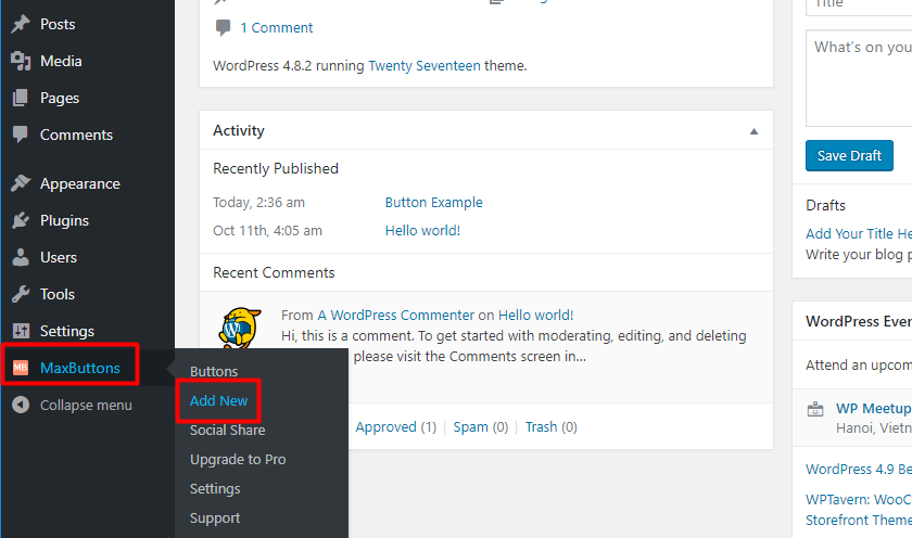
To get started, install and activate the free version right from your WordPress dashboard. Then, head to MaxButtons → Add New to create your first button:
Let’s go through the various sections of the button interface…
Basics: Setting Up Your Basic Button And Alignment
When you land in the MaxButtons interface, the first thing that you’ll want to do is set up your button basics.
As you configure these basic settings, you’ll see a live preview of your button on the right side of your screen:
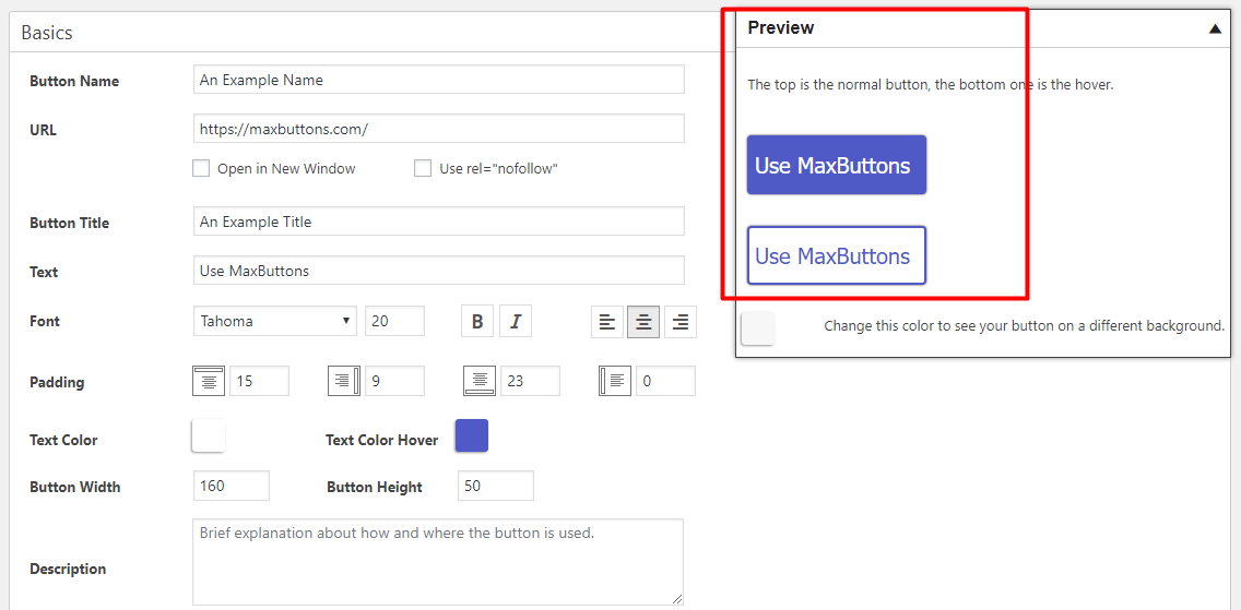
Most of the options here are pretty self-explanatory.
For example, you:
- Put the URL where you want to send people who click the button in the URL box
- Add the text you want to display on your button in the text box
- Configure font, size, and styling in the Font options
Note – while the plugin does ask you to enter the URL and button text here, you’ll also be able to manually change these in the future when you actually insert the button into your content. Near the end of the article, we’ll have a detailed discussion on how to use the shortcode to reuse button styles without creating separate buttons for each link.
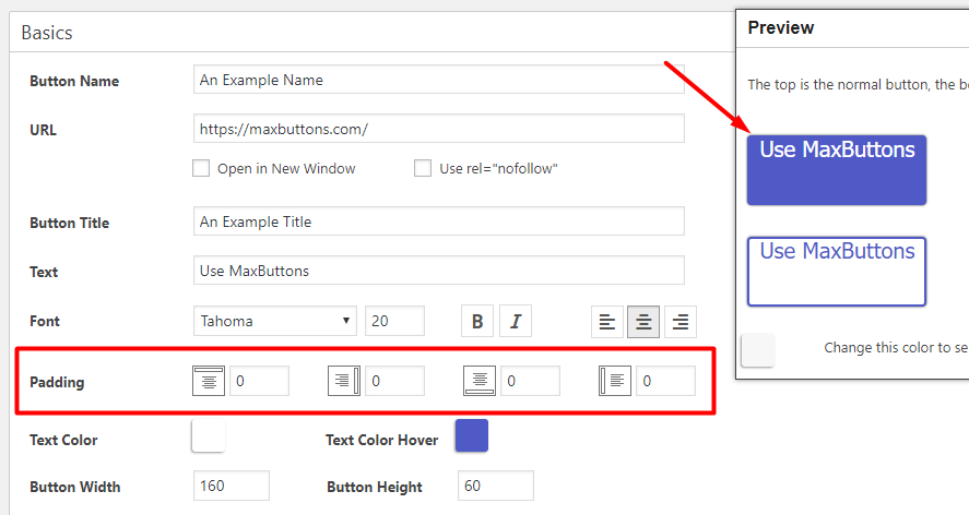
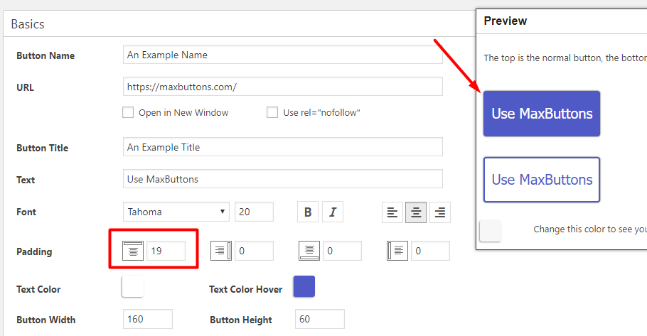
There are two somewhat tricky options to consider:
- Padding – padding helps you change the alignment between the text and the outside of your button.
- Button Width and Button Height – these help you control the actual size of your button, regardless of the text inside.
For padding, you can add padding to each individual “side” of the button. That is:
- Top
- Left
- Bottom
- Right
As you change the dimensions of the button, you might need to adjust the padding to make sure your text is properly aligned.
For example, if you set all the padding to zero, your button text will be awkwardly aligned at the top of the button:
That doesn’t look very good, does it?
So to fix things, you could add some top padding to move the text down:
Looking better, right?
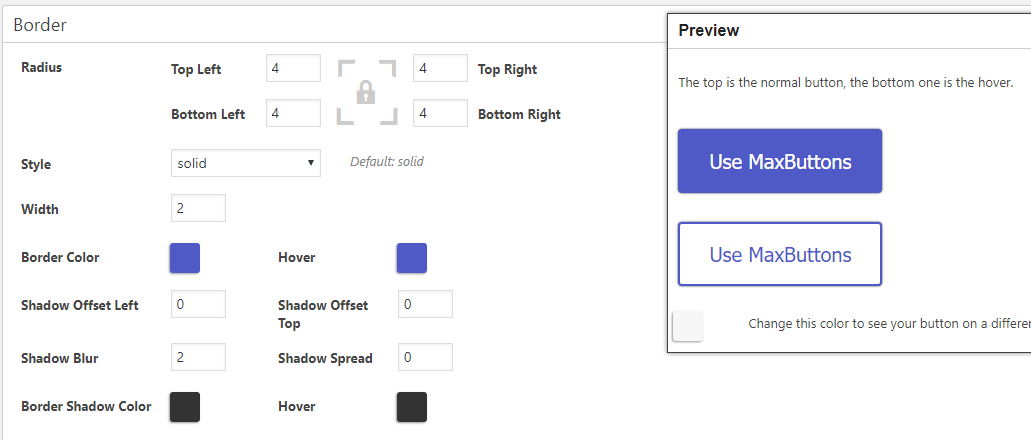
Border: Add Rounded Edges, Shadow And/Or A Border
The Border section lets you configure three important button effects:
- Border radius – this lets you choose whether to give your button square or rounded corners.
- Border color and style – this helps you configure a distinct border, if desired.
- Shadow – this lets you add a neat shadow effect to your button’s edges.
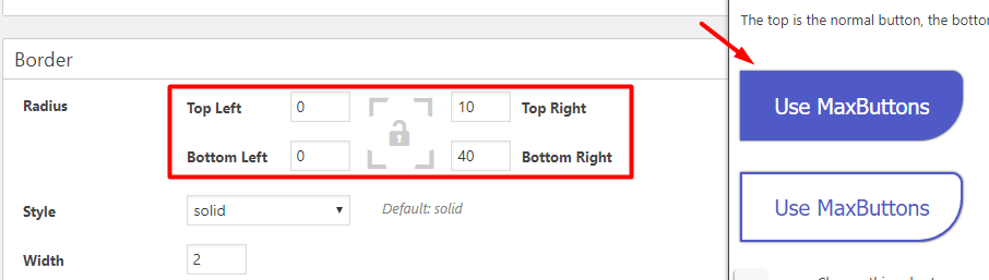
Let’s start with the Radius area. If you set the radius as 0, your button will have square, 90-degree corners. On the other hand, as you increase the number, your button will have increasingly rounded corners.
Usually, you’ll want to set the same radius on all four corners. But for the purposes of illustrating the differences, we’ll use different values:
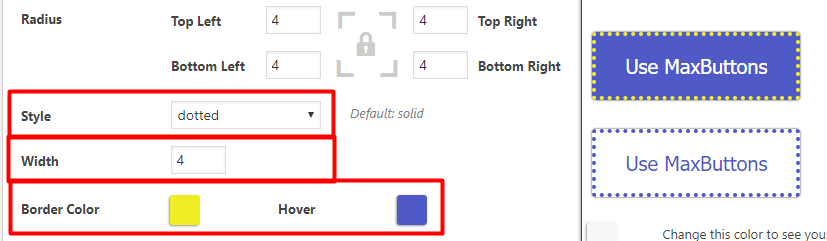
Style, Width, and Border Color help you add an actual border to your button. Again, we’ll create a jarring yellow border just to illustrate how this concept actually works:
Finally, the Shadow options provide some interesting ways to enhance the look of your button.
Generally, you’ll want to avoid adding shadow to all four sides of your button as it is’t very aesthetic. You’ll probably want to add shadow to just the bottom and right-side of your button.
To do that, increase the values for Shadow Offset Left and Shadow Offset Top. In the example below, you can see how the shadow is “moved” down and to the right:
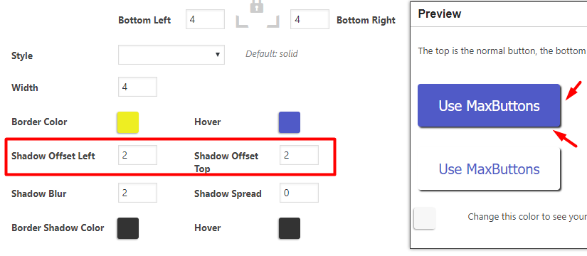
If you want to add more shadow, you can adjust the Shadow Blur and Shadow Spread values. And you can also change shadow colors by using the color-picker boxes.
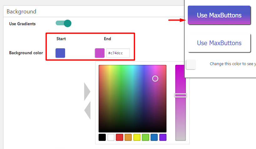
Background: Change Colors, Opacity, Use Gradients
In the Background section, you can adjust the background color(s) for both the regular and hover version of your button.
These options are fairly self-explanatory. The only potentially tricky setting is Use Gradients. When enabled, gradients let you create a multi-color button that “moves” from one color to another:
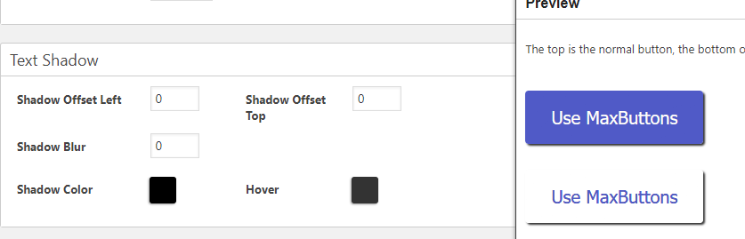
Text Shadow: Add Shadow Effects To Text
Like the shadow options you saw in the Border section, the Text Shadow section lets you add similar effects to the actual text inside of your button design.
Text shadows work the same Border shadows – they just apply to a different part of your button:
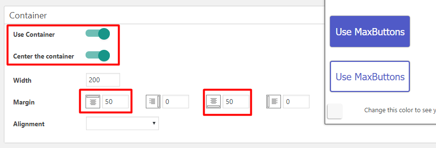
Container: Put Your Button Inside A Container
One of the advanced CSS techniques that we mentioned above involved putting your buttons inside a separate container to better control their positioning.
MaxButtons can actually do this for you right from the interface. In the Container section, you can choose whether or not to use a separate container, as well as the size and spacing for that container.
So, when should you use this feature?
Use it if you want to add consistent spacing to your button. For example, if you always want your button to be center aligned on the page and have a margin between the button and surrounding text, you should use this feature for consistency.
On the other hand, if you’re planning to manually adjust the positioning of your button each time, or put it somewhere like a sidebar widget, you might want to leave the container option turned off.
If you configure the button like in the example below, it will always be center-aligned and have a 50px margin on the top and bottom:
Advanced: Not Necessary Most Of The Time
Most of the time, you won’t need to use any of the settings in the Advanced tab. Three of these options are focused on modifying or tweaking CSS. The Custom Rel Tag does have some neat applications, though.
With Custom Rel Tag you can use your button to activate a lightbox or popup. This is neat if you want to, say, create your own two-step opt-in forms or something similar.
Responsive Settings: Change How Your Button Looks On Individual Devices
In the Responsive Settings, you can modify how your button looks for different devices.
The plugin does offer an experimental Auto Responsive feature that tries to make your button responsive without any human input.
But you can also do things manually by creating a New Query. A Query is a CSS tactic for applying different styles to different devices and/or screen sizes. And you don’t need to know the CSS underpinnings to use the feature!
Instead, you can just choose one of the options from the drop-down and then add some new rules for those devices:
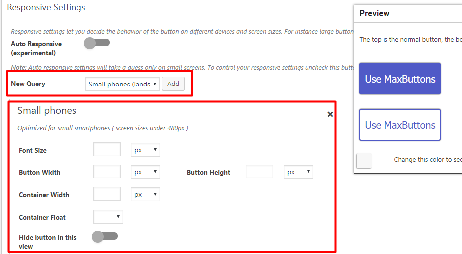
Or, you can even hide your button on specific devices by toggling on the Hide button in this view option.
How To Properly Use The MaxButtons Shortcode To Insert Buttons Into Your Content
With MaxButtons you use shortcodes to insert your button(s) into your WordPress content. With these shortcodes you can quickly reuse the same button style over and over with different text and URLs. You do not need to create multiple buttons just to change a button’s text and/or URL.
You can insert MaxButtons shortcodes in two different ways:
- Via the Add Button button
- Manually with shortcode parameters
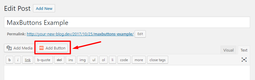
How To Use The Add Button Interface To Add Buttons To WordPress
The simplest way to use the buttons that you create with MaxButtons is the Add Button option in the WordPress Editor.
The next time you go to create a new post or page, you should see a new Add Button option:
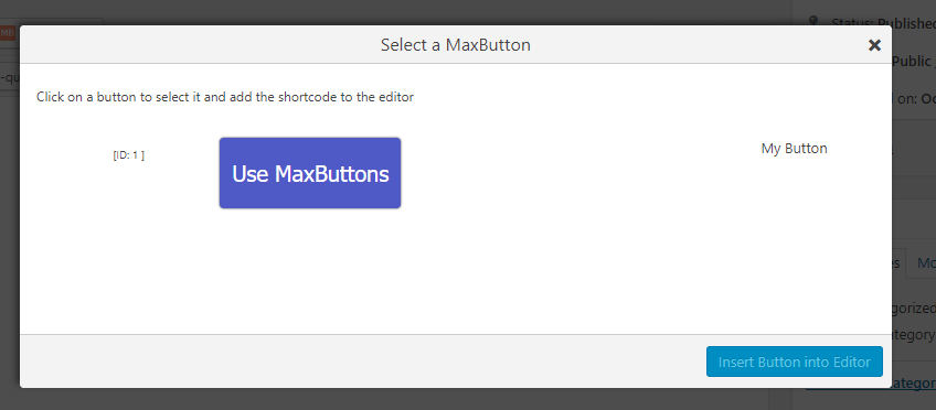
When you click it, you’ll first select the button style that you want to use:
Then you can change the Button URL and Button Text while preserving the rest of the button styling:
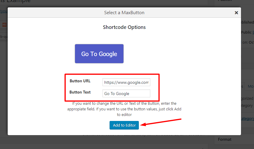
This helps you reuse the same button styling without needing to create an entirely new button each time you want to change the button text or URL.
How To Use Shortcode Parameters To Add Buttons To WordPress
If you’re adding buttons via the WordPress Editor, it’s usually simpler to use the Add Button interface above.
But if you’re adding the button to another area (like a text widget in your sidebar), you might need to work directly with the shortcode.
You can find the base shortcode for a button by going to the main MaxButtons dashboard:
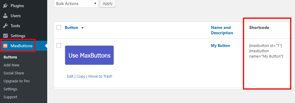
Then you can modify that core shortcode with parameters to change things like its button text and URL. Here’s a partial list of some of the most helpful parameters. Anything you put into these parameters will override the basic settings you used when creating the button:
- text=”YOUR_TEXT” – change the button text
- url=”YOUR_URL” – change the button URL
- window=”true” – force the button to open in a new window
- nofollow=”true” – adds a rel=”nofollow” tag
Here’s a real example of how you can use these parameters to alter your button.
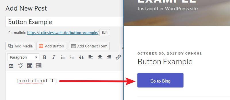
Let’s say you created a button that links to “https://bing.com” and uses the button text “Go to Bing.” Its shortcode is:
[ maxbutton id="1" ]
If you just enter the shortcode (without the spaces), you’d see your button as you originally created it:
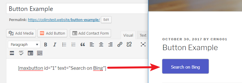
Now, let’s say you want to change the text to read “Search on Bing.” To do that, you would need to add a shortcode parameter for text like so:
[ maxbutton id="1" text="Search on Bing" ]
You’re still using the exact same button as before. But now, the text on the button has changed:
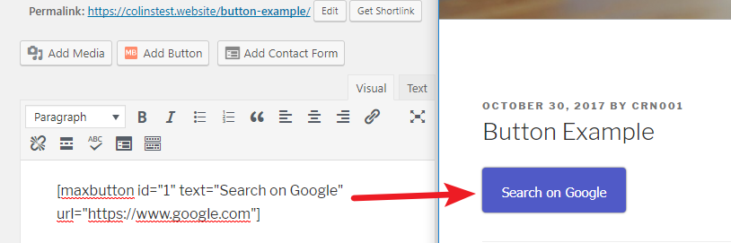
Ok, now let’s say you want to change both the text and the URL. Instead of Bing, you want to send visitors to Google. To do that, you’ll need to add parameters for both text and URL like so:
[ maxbutton id="1" text="Search on Google" url="https://www.google.com" ]
Again, we’re using the exact same button as before. Only now, your visitors will see text for Google and be taken to Google if they click on the button.
Most of the time, you’ll be using just these two shortcode parameters to alter your button’s text and URL.
How To Use MaxButtons Pro For More Advanced Buttons
Everything that you saw above is available in the free version of MaxButtons.
If you want more functionality, you can purchase MaxButtons Pro to get access to:
- Pre-built button packs that look great right from the get-go.
- An option to include icons in your buttons.
- The ability to create buttons with multiple lines of text.
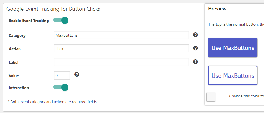
- Easy Google Analytics Event Tracking to track when your buttons get clicked
Go Make Some Buttons For Your WordPress Site
And there you have it! Two different ways to add buttons to your WordPress content.
If you’re code-savvy, you can use your own CSS to create WordPress buttons. But if you’re not, or if you just want a faster method to create buttons, you can use the MaxButtons plugin to do it for you.
Whichever method you choose, being able to insert buttons into your content will make your website more user-friendly and help you draw your readers’ attention to important links.