Website buttons are an essential piece of interaction design. Despite seeming like a simple UI element button design has changed considerably over time while the principles of buttons UX have remained focused on recognition and clarity.
This article covers the evolution of button design and looks at some of the best practices to follow in creating effective buttons.
The Evolution of Style
Three-Dimensional Buttons
One example of buttons from the early days is operating system buttons. These buttons relied on relief and shadow to distinguish them from their surrounding context. This design was based on the simple principle that using a border, gradient and drop-shadow makes the element stand out against the background and content. This makes the button easily identifiable as a clickable element.

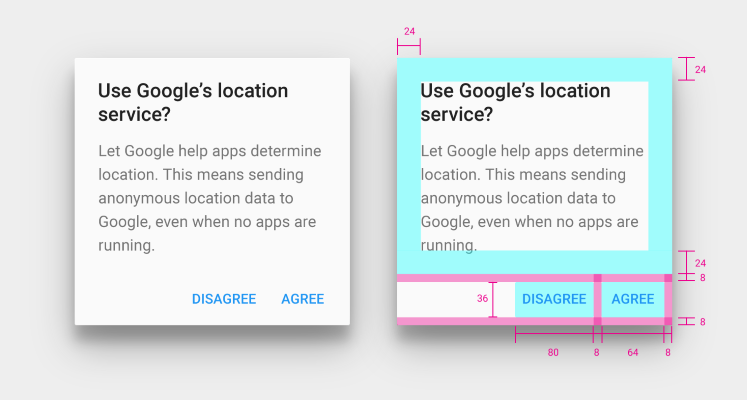
The Windows 95 dialog box below made use of heavy shadows plus highlights to create a 3D effect which was used to help users interpret visual hierarchy and understand which elements are interactive.
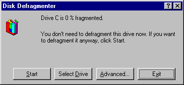 Elements that appear raised look like they could be pressed down(clicked with the mouse)
Skeuomorphic Buttons
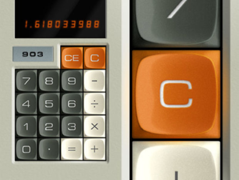
In digital design skeuomorphism is when UI elements are made to look like real life objects, whether it be copying a real life texture, or making a button look like a real life button. Skeuomorphic designs are intended to help users understand how to use a new interface by allowing them to apply some prior knowledge about the object. The calculator metaphor in example below is intended to help users transfer previous knowledge about physical calculators to the digital environment.
Flat Design Buttons
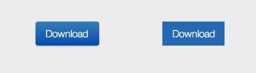
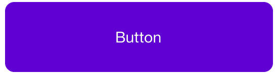
One of the major shifts that has happened in UI design recently is the trend away from skeuomorphic elements towards more flat ones, stripped of 3D effects. Unlike skeuomorphic design, flat design was seen as a way to explore the digital medium without trying to reproduce the appearance of the physical world. As a consequence, it removed the heavy-handed visual cues that have been traditionally used to communicate clickability/tapability to users. Part of this transition was because designers tired of the dated looks of the old buttons which resulted in new design paradigms such as flat design and Material Design. The example below shows an example of a modern regular button and flat button side by side.
When everything on a website uses flat design how do users know which elements are buttons?
Users still need visual signifiers to know where they can click/tap on a page: perceptible clues that help them understand how to use interfaces. Thus, color is especially important in flat design, because when you are using flat buttons colors will be one of the main identifiers that help the user understand the function of the element.
Almost Flat Design and Floating Action Button
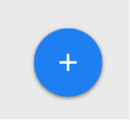
Almost flat design was an evolution of the original (or ultra) flat design. This style is mostly flat but makes use of subtle shadows, highlights, and layers to create some depth in the UI. Google’s Material Design language is one example of almost flat design with the right priorities and it brings a new type of buttons: floating action button (FAB). These buttons are layered over the top of the interface and draw attention to promoted or primary actions. They act as call to action buttons (“used for a promoted action”), meant to represent a single action users perform the most on that particular screen.
Maps by Google is a great example of FAB done right. The main action performed by users on Maps is to get directions, so it makes perfect sense for an FAB that does just that.

Another good example of using FAB in UI design is Evernote. Despite having a mostly flat UI, the app provides a few subtle shadows on the navigation bar and the floating action button (‘add new’).
Ghost Buttons
Since 2014 one of the dominant design trends to pass through the UI design world has been the ghost buttons. Ghost buttons are transparent and empty buttons that have a basic shape form, such as a rectangular or perhaps squared. They are also have titles like “empty”, “naked” or “hollow” buttons. Ghost buttons are generally bordered by a very thin line, while internal section consists of plain text.
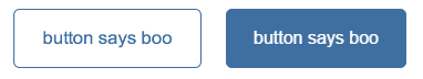
The origin of the ghost button came from the flat design revolution. Ghost buttons become trendy when Apple released iOS 7. Many of the buttons on iOS’ UI were what we would call a ghost button. Simple with a plain rectangular shape in combination with neat font inside the frame looks perfect within flat UI.
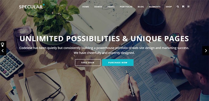
Ghost buttons most often appear as Call to Action (CTA) buttons and offer a clean look. The Specular site below is a good example of ghost buttons.
Basic Best Practices for Buttons
Before you start designing your buttons take some time to think about how your design communicates affordance. Affordance is how your users understand the element as a button? Some things to think about in doing this are:
- Make buttons look like buttons (see Shape)
- Make it easy for user to interact with buttons (see Size and Padding)
- Label buttons with what they do (see Label)
- Use color contrast to guide users to action (see Color)
And be sure to maintain consistency throughout your interface controls, so the user will be able to identify and recognize your app or site UI elements as buttons on each page. Creating a design specification for the entire site including a complete list of all elements is the best way to achieve consistency throughout your site.
Shape
A safe bet is to make buttons square or square with rounded corners, depending on the style of the site or app. Rectangular shaped buttons were introduced into the digital world a long time ago and users are familiar with them.
Some research suggests that rounded corners enhance information processing and draw our eyes to the center of the element.
You can be more creative and use other shapes such as circles, triangles or even custom shapes, but keep in mind the latter might be a bit more risky.
Size and Padding
The size of buttons also play a key role in helping users to identify these elements. You should consider the size of button elements as well as the padding between clickable elements:
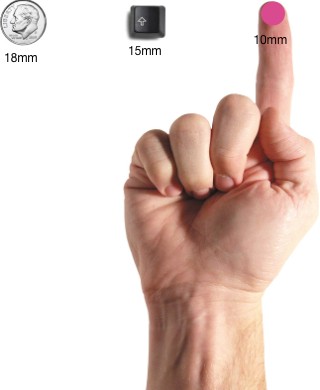
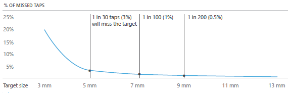
Size. When tap is used as a primary input method for your app or site you can rely on MIT Touch Lab study in order to choose a proper size for the your buttons. MIT study founds that averages for finger pads are between 10–14mm and fingertips are 8–10mm, making 10mm x 10mm a good minimum touch target size.
This suggestion isn’t for perfect for creating error-prone touch targets but rather minimizes the number of errors to the practical level while balancing other important characteristics (like screen information density):
When mouse and keyboard are the primary input methods, button measurements can be slightly reduced to accommodate dense UIs.
Padding. Padding between buttons helps separate the controls and gives your user interface enough breathing space.
Button Text
You should choose the buttons text wisely. The text should be based on the principle of least astonishment: if button text has a high astonishment factor to the users you might want to change it.
A rule of thumb — button text should correspond highly with what the buttons do when clicked. Add a clear message of what happens after the click/tap or indicate what an element does using action verbs.
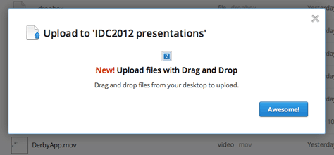
In example below you can see a dialog box which appears when user is trying to upload a file to the Dropbox using web app. This message is offering a single button which has a label ‘Awesome!’ And this label might be confusing for regular users because it’s not clear what the button will do once you click it.
Button Color
When picking a color palette remember to think about how colors will help users navigate and understand the action:
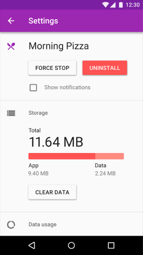
- Use color and contrast to help users see and interpret your app’s content, interact with the right elements, and understand actions. In example below we use red for the button that performs a potentially destructive action.
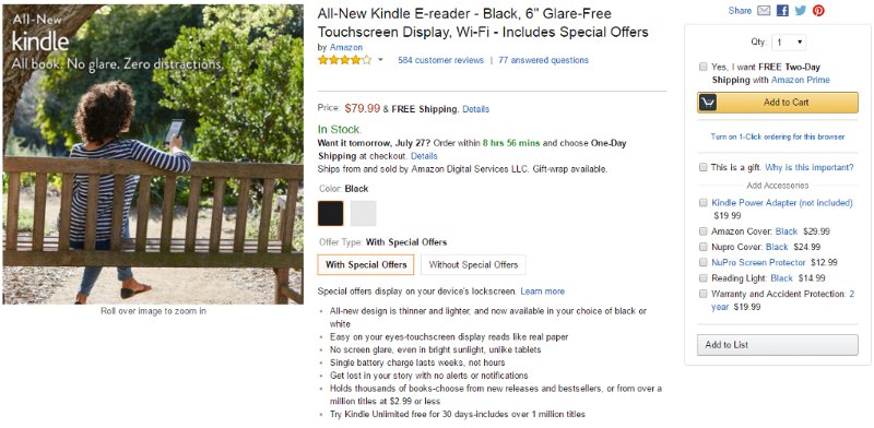
- Make the most important button (especially if you use them for calls to action) look like it’s the most important one. For example, Amazon using a contrasting yellow button to drive user attention to the right action.
In conclusion
Every button (classic or modern one like ghost button or floating action button) is meant to direct users into taking the action you want them to take. Think of the web or app as a conversation started by a user. The button plays a crucial role in this conversation — a smooth interaction keeps the conversation flowing along while glitches (such as an unable to find a right button) create interruptions and, at worst, breakdowns.
This article is an edited version a story written by Nick Babich who has been kind enough to allow us to republish it here as we share his love buttons.