Creating WordPress buttons is extremely easy with MaxButtons Pro. All you need is an idea, the plugin and a few minutes.
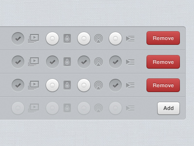
For button inspiration, I generally turn to Dribble or other popular design sites. In this case I’ve selected a “Remove” button to replicate.
With that button in mind it’s time to open up MaxButtons Pro.
Creating The Button
Start off by giving your button a name and description so you can easily remember why you’ve created it. Follow that up with adding the URL where the button will take your visitor.
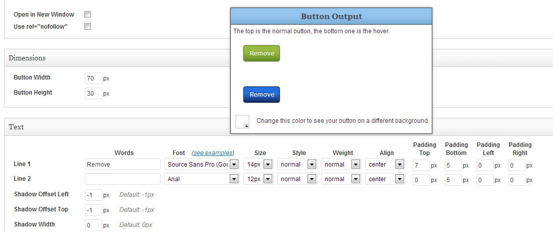
Checking ‘Open in New Window’ will open the URL in a new page and rel=”nofollow” will prevent bots and spiders from tracking the URL in your analytics.
I’d like the button to be 70px wide by 30px high, the rough dimensions of our model button. After adding those dimensions, it’s time to get styling.
Styling the Button Text
You now have the option of adding one or two lines of text. This button only has one word so I’ll opt for one line. For font I’m going to switch it up and use Source Sans Pro, a Google Web font that comes with MaxButtons Pro. Font size defaults to 16px, but I’m going to change to 14px.

Default style is normal, so let’s keep that for now. Switch weight to normal (instead of bold), and add some padding on the top. A value of 7px from the top gets me to the center of my button. The text should be centered, so everything looks good text-wise.
Current button status: DOWNLOAD
Removing the Button Container
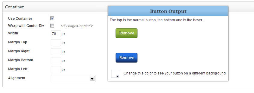
You may notice that when you move your mouse over the button, it takes up the entire width of the page, allowing you to hover over a huge area. For this button, we don’t want that (I’d like to maybe put it in my sidebar). So let’s jump down to the “Container” section toward the bottom of the page.

By default, MaxButtons Pro give your button a container div and aligns it to the center of your page. By unchecking those boxes, our button will now behave with the width we originally set as shown here:
It is now aligned to the left, but the width of the hover is still gigantic. So let’s take a look at “Container” again and set container width to the same width as our button, 70px.
Now when saved, the button looks like this: {c}
Perfect. So now that we’ve set our text and set the proper widths, we can now get to one of the best parts of creating a button, the styling.
Styling Your Button
I like the border-radius where it is, so let’s leave the “Border” styling alone for now. Moving to colors, we can start adjusting the gradients. To figure out the colors of the button shown in the Dribble image, I either use a color dropper in Photoshop, or a browser color dropper, like ColorZilla for Chrome.

My gradient starts at #cd4f4f and ends at #af3131. While we’re on the subject of our background gradients, I’ll take care of the hover state as well, reversing the start and end colors. Start: #af3131 end: #cd4f4f. I also added a border color of #a54442 and Border Shadow: #781a1a.
My button now looks like this: RENEW
I’ve decided I don’t care much for for my font, so I’ll switch it to Arial, bold, 12px, padding-top: 9px (which is the end result above). I think that wraps up my button for now. I’m pretty happy with the result, but it’s missing something, maybe an X icon. We’ll save that for another time.
